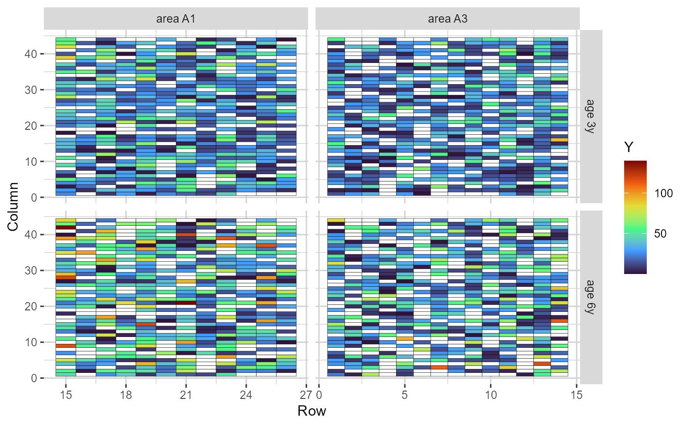
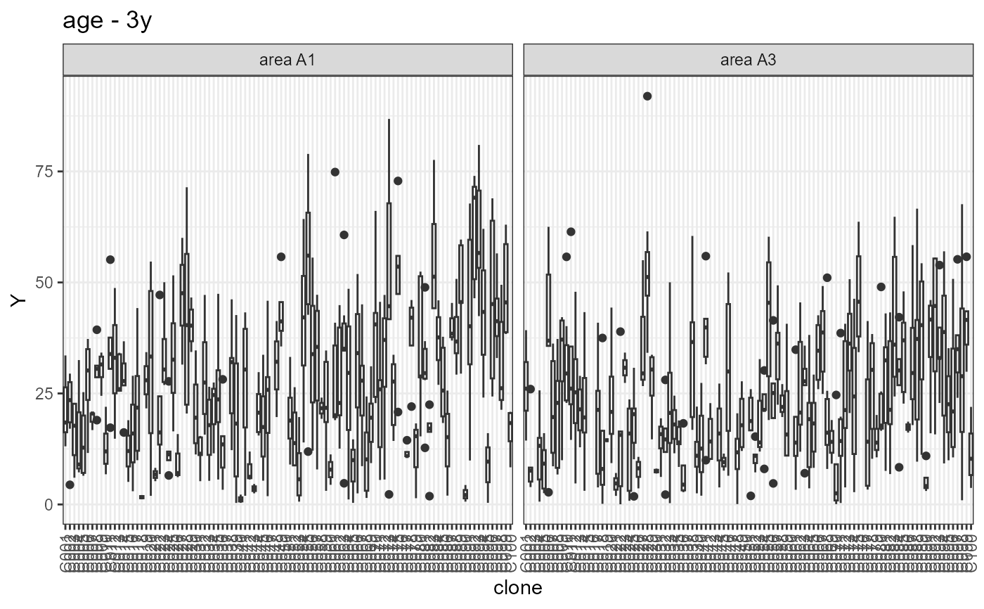
The function generates two types of plots: i) a heatmap representing the grid. The cells are filled according to the phenotype value of each plot; and ii) boxplots depicting the performance of each selection candidate
# S3 method for class 'comprepfor'
plot(x, ..., category = "heatmap", age = "all")
Arguments
- x
An object of class
comprepfor- ...
Currently not used.
- category
A string indicating which plot to build. Options are
"heatmap"for plotting the field grid (default), or"boxplot"for plotting the boxplots of phenotypic performance.- age
A string indicating if plots should be built per age. Options are
"all"for plotting all ages using facets, or the name of the specific age. Defaults to"all", which also serves when data has a single age
See also
ggplot2, prepfor
Examples
# \donttest{
library(gencomp)
comp_mat = prepfor(data = euca, gen = 'clone', area = 'area',
plt = 'tree', age = 'age', row = 'row', col = 'col',
dist.col = 3, dist.row = 2, trait = 'MAI', method = 'SK',
n.dec = 3, verbose = FALSE, effs = c("block"))
plot(comp_mat, category = 'heatmap', age = "all")
 plot(comp_mat, category = 'boxplot', age = "3y")
#> Warning: Removed 284 rows containing non-finite outside the scale range
#> (`stat_boxplot()`).
plot(comp_mat, category = 'boxplot', age = "3y")
#> Warning: Removed 284 rows containing non-finite outside the scale range
#> (`stat_boxplot()`).
 # Note that the ages are labelled as "3y" and "6y" in the example dataset
# }
# Note that the ages are labelled as "3y" and "6y" in the example dataset
# }